Skip the endless mood-boarding. Here’s how to choose wedding colors that feel like you and photograph beautifully.
Choosing a color palette can feel like the first real test of taste during wedding planning. It’s somehow also the decision that unlocks everything else. Once you settle on colors, the flowers start making sense, the stationery falls into place, and even your dress shopping gets a little easier. The hard part is getting there without scrolling through five hundred mood boards and ending up more confused than when you started. Picking a wedding colors only requires a few decisions made in the right order, starting with the things you can’t change and working toward the things you can.
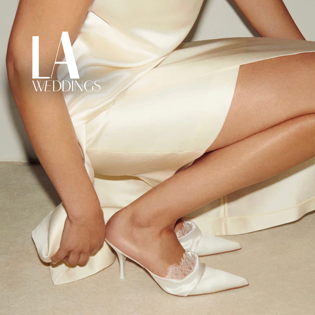
READ ALSO: A Bride’s Guide To Choosing The Right Wedding Footwear
Start With What’s Fixed
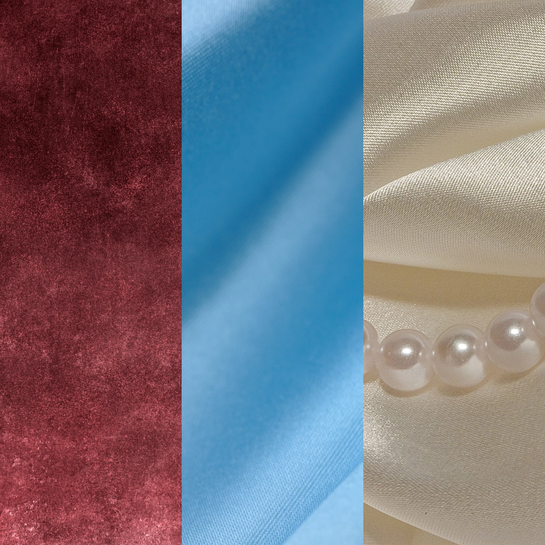
Before you fall in love with a Pinterest board, look at what’s already decided for you. Your venue has a color story whether you planned one or not. A beach wedding can be bright and warm by default, while a traditional church wedding can incorporate rich reds and pearly creams.
If you plan on getting married in the more temperate parts of the world, the season matters just as much. A palette that looks gorgeous in a June garden can feel out of step in December, and vice versa. This doesn’t mean you’re locked into seasonal clichés like pastels in spring and burgundy in fall, but it does mean checking your colors against the actual light and landscape you’ll be working with on the day.
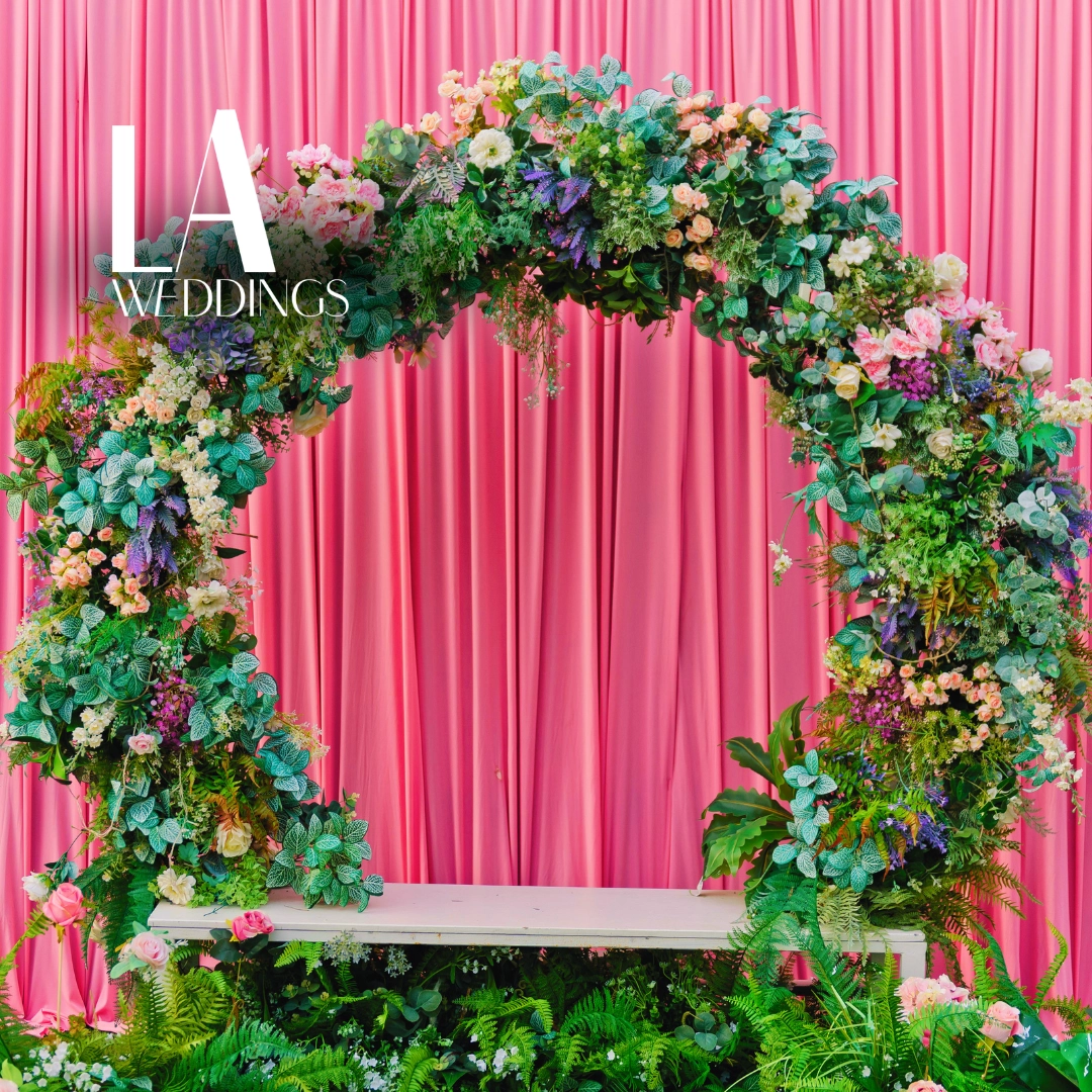
Find One Image
The fastest way to land on a palette is to stop hunting for “wedding colors” and start with a single image that already moves you. Maybe it’s a painting, a piece of vintage fabric, or a flower arrangement you saw in your parents’ old wedding photos. Pull three to five colors directly from that image rather than starting from scratch. This approach works because real images already balance their colors for you.
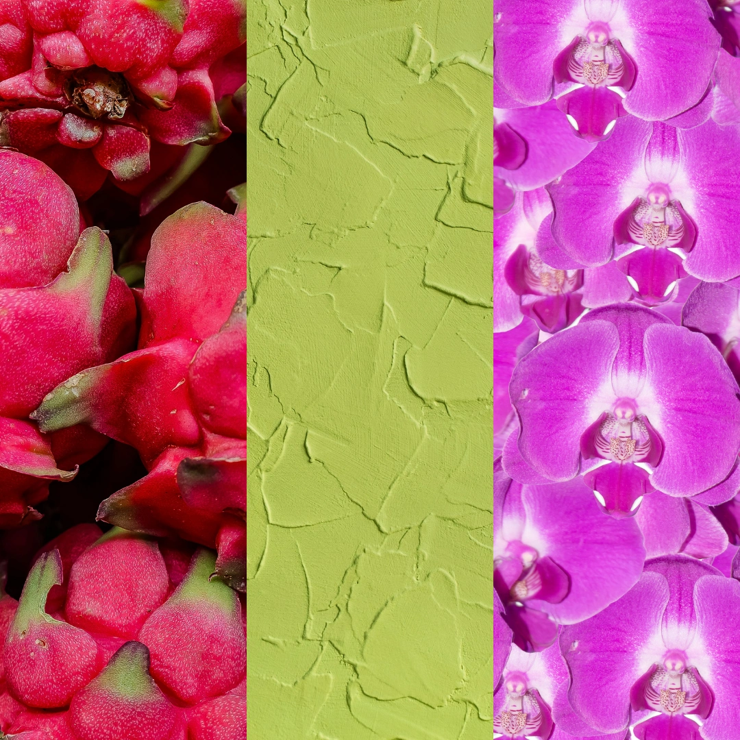
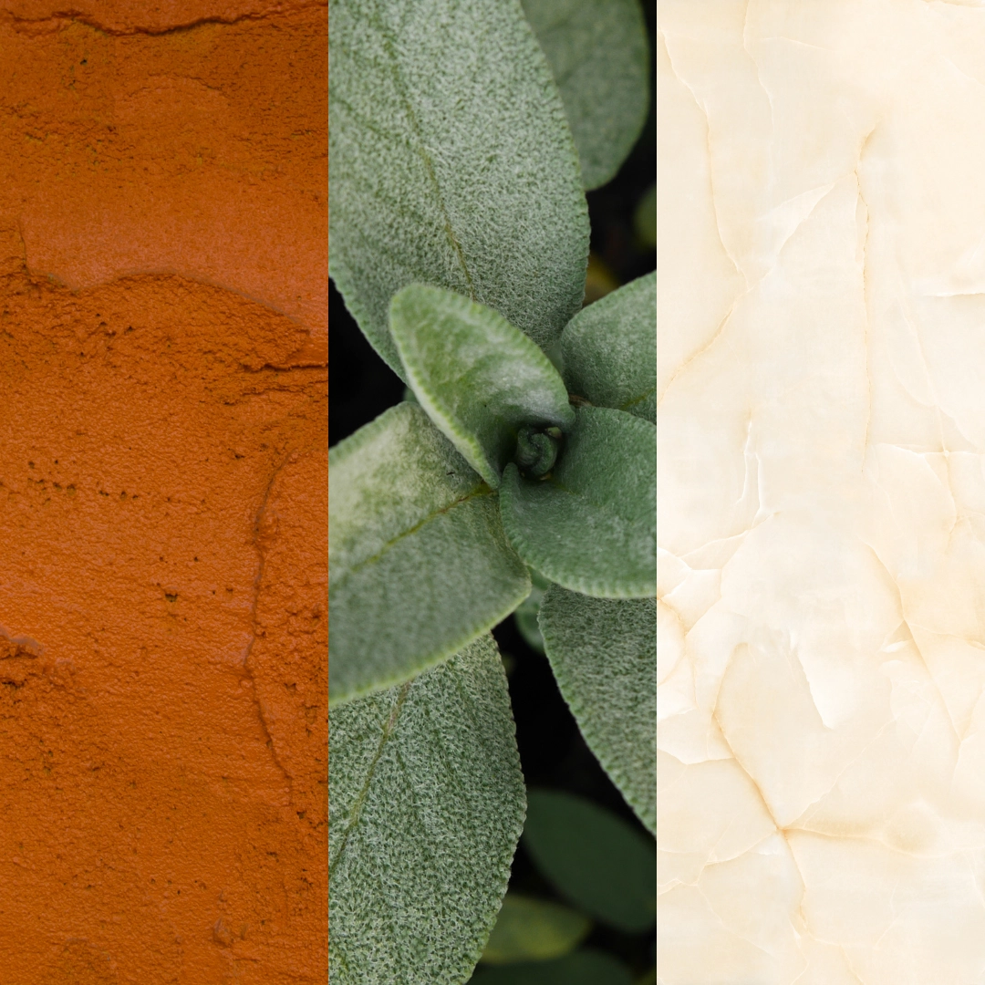
Decide If Your Palette Is Warm Or Cool
Before you commit to specific shades, decide whether your palette leans warm or cool. This single choice does more to narrow your options than almost any other step in the process. Warm palettes, built around tones like terracotta, gold, blush, and cream, tend to photograph rich and inviting, especially in golden hour light. Cool palettes, built around dusty blue, sage, silver, and lilac, photograph crisp and elegant, particularly indoors or under string lights at night.
Mixing warm and cool tones isn’t forbidden, but it takes a steadier hand. If you’re building your first palette, choosing one temperature and staying mostly within it will save you from a lot of second-guessing later.
Assign Each Color A Job For The Wedding
A palette with too many colors competing for attention can look cluttered no matter how nice each individual shade is on its own. The fix is giving each color a specific role instead of treating them all equally.
Pick one dominant color for the big surfaces. This would be your linens, your bridesmaid dresses, your aisle runner. Add one or two accent colors for the smaller details, like ribbons, signage, candle holders, or the inside of a bouquet. Then choose a neutral—something like ivory, sand, or charcoal—to tie everything together and give the eye somewhere to rest.
This structure is why hotel rooms and magazine spreads always look put together. It’s not that they use fewer colors necessarily, but it’s that every color has a job.
Test Your Wedding Color In Real Light
A swatch on your laptop screen and a swatch under a reception tent are two very different experiences. Before you finalize anything, hold your fabric, ribbon, or paint samples next to your actual flowers, your suit fabric, and your dress, then look at them in daylight, and again under the kind of lighting your venue will actually use at night. Warm bulbs can wash out cool blues. Fluorescent lighting can flatten anything with too much pastel in it. What looks elegant in a sunny room can look rather drab once the sun goes down.
Frequently Asked Questions
Start with what’s already fixed, like your venue and the season of your wedding, since both will naturally limit and guide your color choices before you even open a mood board.
Yes, ideally. Your venue already has a built-in color story, whether it’s warm wood and hay tones in a barn or cool stone and glass in a modern ballroom, and choosing colors that work with that setting creates a more cohesive look.
The dominant color is the one used for the largest elements of the wedding, such as linens, bridesmaid dresses, or an aisle runner.
Test your fabric swatches, ribbons, or paint samples next to your actual flowers and dress in both daylight and the type of lighting your venue will use at night before finalizing anything.
Choose one image you already love, like a painting, a piece of fabric, or a photo, and pull three to five colors directly from it rather than searching for colors from scratch.